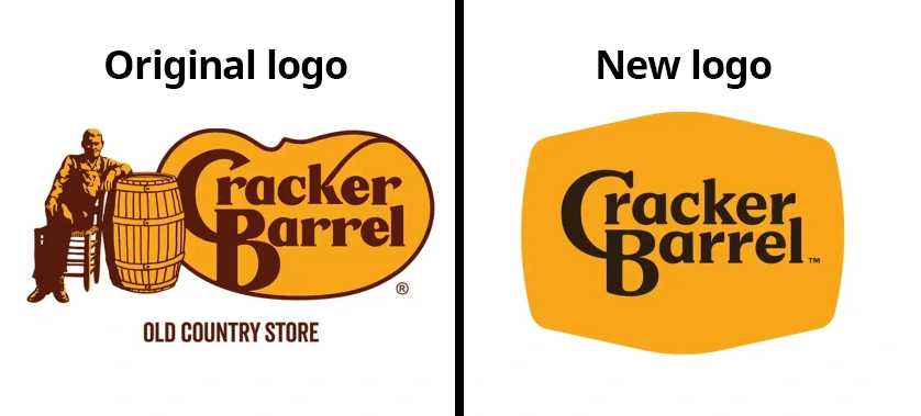
Cracker Barrel’s new logo rollout was framed as modernization. CEO Julie Felss Masino and her team said the redesign was about making the logo “easier to use across digital platforms and devices.” And yes — there’s logic to that. A logo with Uncle Herschel sitting by a barrel doesn’t scale down neatly to an Uber Eats thumbnail.
But here’s where they went wrong: instead of preserving their legacy brand identity and adding a simplified alternate for digital use cases, they scrapped the old design entirely. Customers felt erased, nostalgia was abandoned, and the stock price dropped by hundreds of millions almost overnight. Ouchie.
This is playschool-easy. Preserve the original. Add a digital-friendly alternate for small screens. Use both depending on context. That’s how you protect emotional equity and adapt to modern platforms. Take a look:

Left: Original logo preserved. Right: Alternate version for digital use cases that retains the character, typography and colors of the original.
Where leadership went wrong
They underestimated emotional ownership. Customers saw the logo not as art, but as memory. Breaking that connection felt like betrayal.
They misread their customers. Cracker Barrel’s base is conservative, traditional families who want comfort food and nostalgia. They weren’t asking for reinvention — they were asking for consistency.
They reached for the easy lever. New leadership often makes design changes early — it’s visible, subjective, and easy to show progress. But updating a logo isn’t the same as modernizing a menu, remodeling stores, or improving operations.
They underestimated emotional ownership. Customers saw the logo not as art, but as memory. Breaking that connection felt like betrayal.
The Media Parallel
This mistake isn’t unique to restaurants. Legacy media has done the same thing, chasing “growth” while alienating the loyal base that paid the bills. Print subscribers — often 50+ — saw fewer pages, fewer sections, and higher prices, all while being forced toward digital products. What publishers forgot was that picking up the paper off the lawn at 6 a.m. was habit, part of people’s daily identity.
With lifespans stretching into the 80s, those readers could have been loyal customers for another 20 years if served what they valued. Instead, they were discarded for the promise of a younger, digital audience that never arrived in equal force and weren’t monetized in the same way.
Cracker Barrel just did the same thing. They abandoned decades of brand equity for a hypothetical new demographic.
Lessons for Execs
- Ask “why?” before making design changes. If the answer is “personal preference” or “digital scalability,” don’t throw away heritage — add to it. Remember, the best design and experience is invisible and frictionless.
- Modernize around the edges, not at the core. Improve the menu, refresh the store, optimize operations — but don’t erase the logo or ritual that defines the customer bond.
- Respect customer habits. Whether it’s a rocking chair on a porch or a paper on the lawn, those rituals are brand equity. Don’t break them lightly.
- Growth doesn’t mean abandonment. Your existing base doesn’t care about your growth strategy — they care about the product they’ve loved for decades. Protect that first.
Bottom line: Growth strategies should be intentional, not impulsive. Nostalgia and habit aren’t liabilities — they’re assets. The smart play is to honor what customers already value while carefully layering in digital relevance. Cracker Barrel could have had both. If you’re reading this, Cracker Barrel, reach out to Transformation Labs; we can help you fix the problems you’re facing.


